The Basics of a ggplot
The {ggplot2} Package
For graphing most people use the package {ggplot2}, which is part of what loads when you loaded the {tidyverse} library. This package is great because all graphing commands have a common syntax this follows the formula:
ggplot(data = _______, aes(x = _______, y = _______) +
  geom_TYPEOFPLOT()
Let’s parse that out:
ggplot()is the base command that makes graphs, it comes from the{ggplot2}packagedata= the data set we want to useaes()stands for aesthetics, it’s where you tell R what you want to be on the graphx =is where you name your x variabley =is where you name your y variablethe line ends with a
+showing you that the code continues on the next linegeom_TYPEOFPLOT()is where you specify what kind of graph you want to make, the most popular options are:scatterplot:
geom_point()line graph:
geom_line()bar plot:
geom_col()orgeom_bar()histogram:
geom_histogram()boxplot:
geom_boxplot()
There are many other add-ons, but just those two lines of code will get you started for most types of graphs.
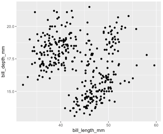
Scatterplot of Penguin Bills
For the Palmer penguins data, we can make a scatterplot to show the relationship between bill length and bill depth for all penguins.
You should see a warning message that says:
Warning: Removed 2 rows containing missing (‘geom_point()’).
This message is actually good: it means that ggplot removed two rows of data that contained missing NA values. That’s pretty helpful.
You should also see the plot below. Note that the x and y-axes are just the names of the columns. We can change this later. You also may see clustering and might be wondering if that correlates to the different species. You would be right, let’s learn how to add colors!