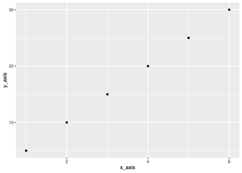
Scatterplot
Here’s an example of some code that makes a very simple graph. See if you can understand what the individual lines are doing, and remember you can run each line separately or run the code chunk as a whole. One of the commands, data.frame(), is new. Run ?data.frame to read about it.
You should see the graph below as your output. It’s really basic, but we can make it as pretty as we’d like it to be by adding more options. You’ll learn just a few in this workshop, but you can find many more online.
Scatterplots are useful when you want to show a relationship between two variables that are both numerical. Often you have an independent variable on the x-axis and a dependent variable on the y-axis and you are trying to observe a cause and effect relationship.
Scatterplots are also good for showing correlations or trends between variables that may not directly affect one another or that have a complicated relationship where both affect each other. These plots would just show observational data but not a cause and effect relationship, so it doesn’t really matter which is x and which is y.
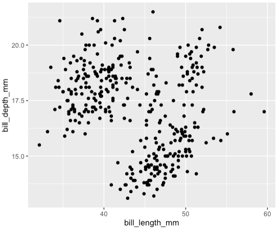
Graphing Penguin Bills
For the Palmer penguins data, we can make a scatterplot to show the relationship between bill length and bill depth for all penguins.
You should see a warning message that says:
Warning: Removed 2 rows containing missing (‘geom_point()’).
This message is actually good: it means that ggplot removed two rows of data that contained missing NA values. That’s pretty helpful.
You should also see the plot below. Note that the x and y-axes are just the names of the columns. We can change this later. You also may see clustering and might be wondering if that correlates to the different species. You would be right, and you’ll learn how to color the points in the Colors page of the workshop.