Bar Plot
Bar Plot
We can do the same thing with geom_col() to change from a line plot to a bar graph.
You’ll see this graph: 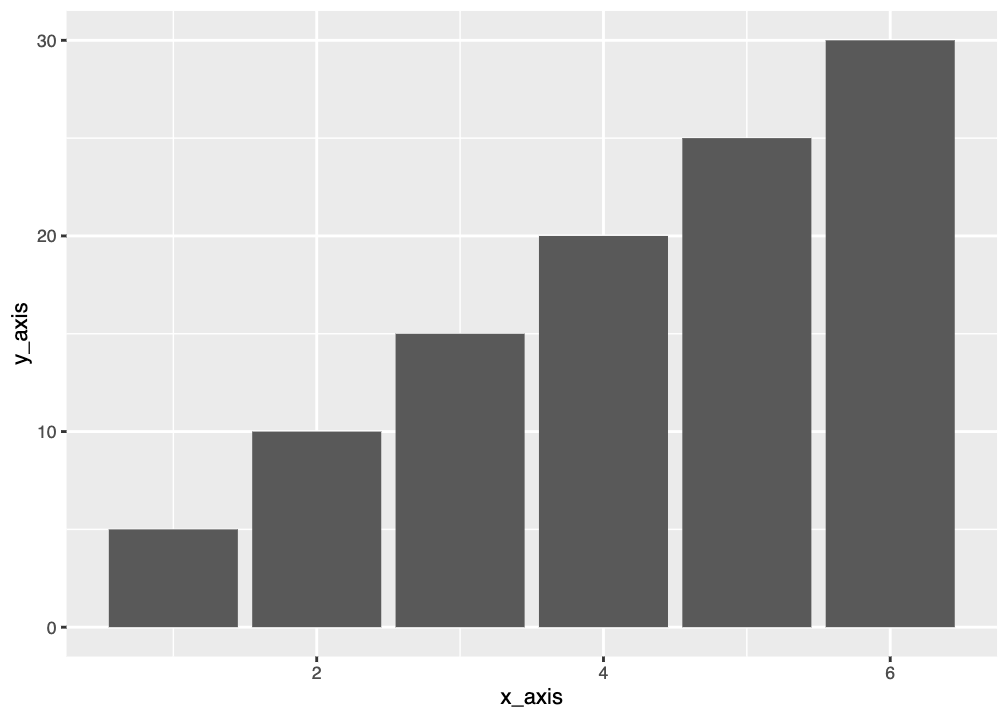
Graphing Penguin Mass
Bar graphs are good for when you have single values, so we’ll need to graph average penguin mass again. This time let’s do it by species.
Now we’ll plot the bar graph. Fill in the missing section and then run the code.
geom_col vs geom_bar
You may be wondering about the difference between geom_col() and geom_bar(). They both make bar plots but they need different types of data input. geom_col() needs you to specify a y variable, while geom_bar() wants to count up the frequency of your x variable and will use that as the y variable. You run geom_col() when you have designated distinct y values to plot; you run geom_bar() when you have only have distinct x values and you have a list of y values.
So, if we wanted to make a graph using geom_bar() we’d need to use a variable where we want to count up the frequency. We could do this for number of individuals in each species. We’d only need to specify species and then geom_bar() will do the counting. Note that we’re using the full penguins dataset to do this.