Line Graph
Since the ggplot* syntax has a very basic format, we can try just swapping out the plot type from our scatterplot code to see how things change.
*Yes, the package is actually called
{ggplot2}but everyone just calls it ggplot.
We can use the same code in the previous graph example to make a simple scatterplot. All we need to do is change one thing: instead of geom_point() we’ll use geom_line() as the type of graph.
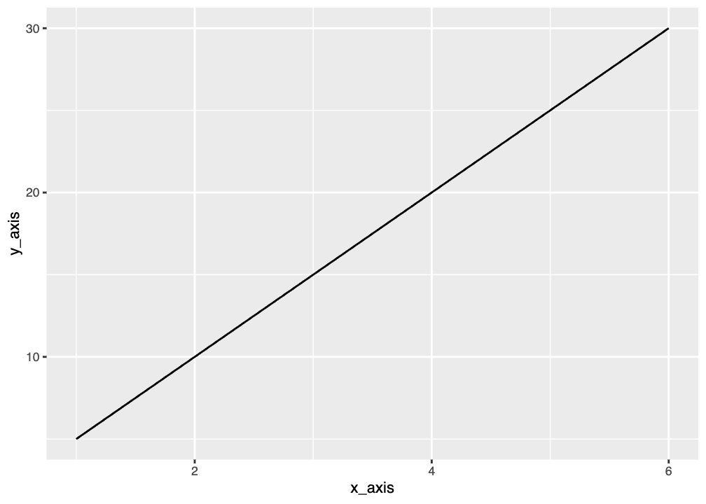
A line graph is most useful when data is sequential or ordered. Line graphs are good for showing things like change over time.
Graphing Penguin Weight Over Time
We can try to make a line graph of penguin mass by year. Try running this code and see what you get.
That probably doesn’t look how you expected! Any guesses on why?
We don’t have single values for mass for each year. We would need to use the average mass or use a different type of plot.
When making a line graph you need single points to connect. We can group and summarize our penguin data to get average mass. We’ll also need to add a line to remove NA values since this isn’t automatically done for us outside of
Now we’ll graph using the summary dataset:
Not the best graph because we have very few years, but you get the idea.