data |>
    group_by(whatever) |>
summarize(Average = mean(column, na.rm = TRUE))Analysis & Visualization
Now we want to calculate summary statistics to help us understand our data better.
Goals from before:
- see completion rates across time and across colleges
- see if there are differences between race and sex
- see raw number of graduates for Reed to see how we’re doing over time
- make plots to show interesting trends
- show statistical differences
- predict future graduation rates
Graduation rates across time
We’ll start with looking at completion rates across time for different colleges. Let’s think about what our end point will be first, that way we’ll now what we need to do.
- we want a line graph showing graduation rate over time for each school
- need single x, single y for each poing
- filter so we just have the totals for each year
Differences between graduation rate by sex
We’ll look at overall trends here first. So, just in general, do the sexes have different graduation completion rates.
- we want to compare individual sexes as limited by the data
- this means we can only compare male to female
- we need to remove anything that isn’t one of those two
- we need summary stats for each sex to compare (ex: mean)
- we can do this for all years or for individual years
- we’ll visualize with a boxplot
- see if the differences are significant
Differences between graduation rate by race
We’ll look at overall trends here first. So, just in general, do the sexes have different graduation completion rates.
- we want to compare individual races
- this is public data, so it’s all freely available to you, but there are still laws about privacy that confusingly apply to it
- any combination of factors that results in a group smaller than 5 students is illegal in some way
- we need to recode small groups into an “other” category
- we need summary stats for each race to compare (ex: mean)
- we can do this for all years or for individual years
- we’ll visualize with a boxplot
- see if the differences are significant
Specific Reed College data
We’ll look at how things are going at Reed. We’ll look at number of students that graduated each year and number that didn’t out of the total number of students. We’ll find a line of best fit for our completion rates. Then we’ll predict what completion in future years might be.
- we want to compare raw numbers of grads vs non-grads
- we have totals and grads, so we need to add a column for non-grads
- we’ll make a stacked bar plot to show grads and non grads
- to do this, we’ll need to pivot our data to be more easily graphable
- we need summary stats for each race to compare (ex: mean)
- we can do this for all years or for individual years
- we’ll visualize completion rate over time for different groups
- we’ll add a best fit line
- we’ll use a linear model to understand the relationships
- from this model we can see how our different sex and race variables influence completion rates
- we’ll use the
predict()function and our linear model to predict future student success- the following code will generate the empty dataset that we want to add our predictions to
Empty dataset for future predictions:
Operators & Functions We’re Using
For more on any of these functions see the Cleaning & Wrangling: Part 2 workshop.
Grouping Data by Factor
In order to parse our data down to a useful level for analysis, we will group certain variables when collecting summary statistics. Common things to group by are location, time, and demographics. We use the function group_by() to tell R to analyze these groups separately. The more things you group by, the more granular of a look you can get at the data.
group_by() on its own kinda looks like it is doing nothing, but it is powerful when combined with summarize().
Summarizing Data by Different Statistical Measures
The summarize() function will make a new data table based on how you want to quantify your data. A typical example is to use it with basic statistical functions like mean(), sd(), median(), min(), or max(). The new table will have column names if you specify them with an = before the function.
Sometimes you’ll notice that you get NA for your outcomes when you should be getting a number. This is because summarize() does not automatically remove missing values that are labeled NA. The easiest way around that is to add the argument na.rm = TRUE inside the summarize() function like so:
The {ggplot2} Package
For graphing most people use the package {ggplot2}, which is part of what loads when you loaded the {tidyverse} library. This package is great because all graphing commands have a common syntax this follows the formula:
ggplot(data = _______, aes(x = _______, y = _______) +
  geom_TYPEOFPLOT()
Let’s parse that out:
ggplot()is the base command that makes graphs, it comes from the{ggplot2}packagedata= the data set we want to useaes()stands for aesthetics, it’s where you tell R what you want to be on the graphx =is where you name your x variabley =is where you name your y variablethe line ends with a
+showing you that the code continues on the next linegeom_TYPEOFPLOT()is where you specify what kind of graph you want to make, the most popular options are:scatterplot:
geom_point()line graph:
geom_line()bar plot:
geom_col()orgeom_bar()histogram:
geom_histogram()boxplot:
geom_boxplot()
There are many other add-ons, but just those two lines of code will get you started for most types of graphs.
For more on graphing see the Graphing Basics workshop. And for even more see the Graphing Aesthetics workshop.
Pivoting tables for ease of analysis
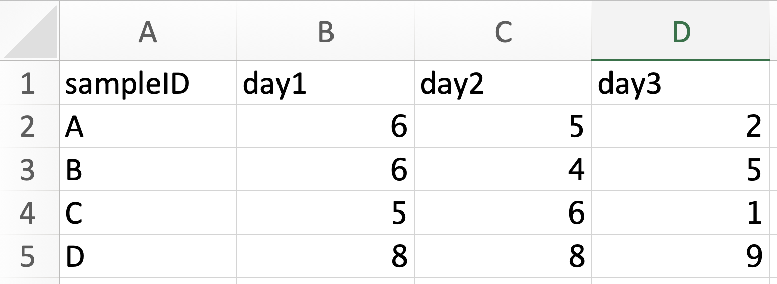
Pivoting is taking a dataset and reshaping it to change how columns and rows are organized. It’s easiest to understand with a visual example. Here are two tables that are pivots of one another.
Wide:
Long:
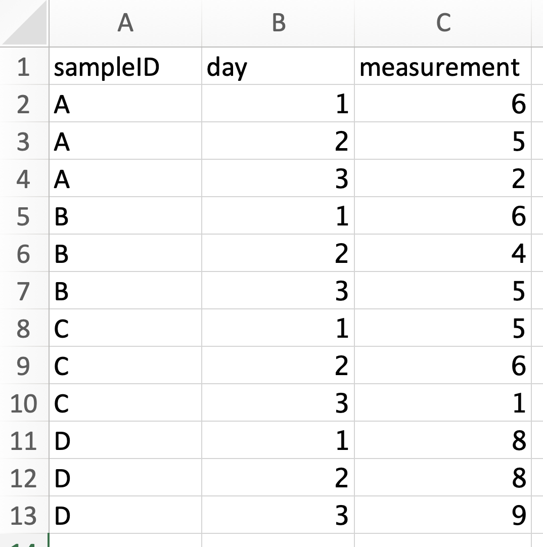
The wide format table is more commonly used when you are creating your own datasheet because it’s easier to enter data in wide format. You can see that there is a lot less repition in the wide data. But the long format is often much easier to analyze. In long format, every row contains all the information for a single measurement and each column represents the same type of data. Long format data is also frequently referred to as “tidy data”.
When we pivot tables we are moving between long and wide format. To do so we use the functions pivot_longer() and pivot_wider().
For more on pivoting see the pivoting workshop.
Comparing Two Groups: T-test
The typical t-test is a statistical test used to compare the means of two groups to see if they are different than one another. This is commonly called a two sample t-test because you have two groups you’re comparing against each other.
In R, a t-test is performed with the function t.test(), which uses R’s standard notation for many statistical tests. It is as follows:
function(dependent_variable ~ independent_variable, data = your_data)

# function can be things like t.test, anova, lm (linear model), etc
The ~ can be read as “as a function of” or “y as predicted by x”. So, it shows how the pattern of the x variable explains the pattern of the y variable.
Comparing More Than Two Groups: ANOVA
An ANOVA stands for analysis of variance, and it is a test used to see if there are differences between three or more groups. So, if you have two groups, run a t-test, and if you have any more than that run an ANOVA.
To run an ANOVA in R, you use the function aov() and the function summary() or tidy() to understand the results. The syntax is the same y ~ x format as many R functions.
An ANOVA will only tell you if differences exist; it does not tell where those specific differences are. To do that you need to run t-test comparisons between pairs of your variables. The way to do that after running an ANOVA is to use a Tukey test with the function TukeyHSD() to automatically compare all groups.
Linear Model
Often, we are looking to understand if one variable is a good predictor for the other. We can plot this as points and find a straight line that best fits through these points, aka a linear model. If one variable perfectly predicts the other, the line will have a slope of exactly 1.
What we want to do is calculate the slope of our line to see how well our x-variable predicts our y-variable. Mathematically, the calculation for our line is y = mx + b.
The code for finding the math of the line is lm(y ~ x, data = your_data).